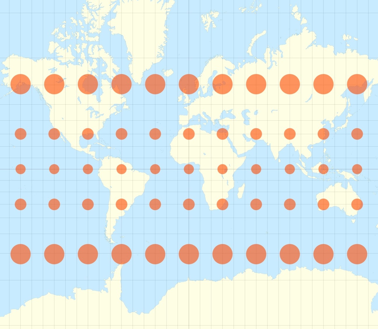
Figure 1. Scaling effect of global maps. The circles would all have the same size on the Earth’s surface. [1] Copyright: BY-SA 2.5 (Eric Gaba)
How did this happen? Our maps are older as we think. A Belgian geographer and cartographer Gerhard Mercator from 1569 designed those maps we are still looking at. This model is convenient for the seafaring, because you need equatorial azimuthal projections for navigation. In terms of ratios of the countries, the model is indeed sometimes wrong. It does show Greenland and Antarctica totally stretched and therefore bigger as they are. For example, Africa is 14 times larger than Greenland in reality. Madagascar is actually bigger as the United kingdom. Where Ireland also is 3 times smaller than it seems to be on a map of Mercator (see Fig. 2).

Figure 2. Direct comparison of different regions
There are several approaches now on shedding some light on this fact. One webpage showing the optical illusions is called “true size” [4]. Here you can move countries to another region of the earth and their scale will be dynamically adjusted dependent on the local distortion of the map. Another example is given here with a map built using the Cahill–Keyes projection (first proposed by Cahill and refined by Keyes in 1975). In this ensemble, the map provides an easy understanding of the continents with a minimized distortion (Fig. 3). Of course, another possibility to have a quite precise image of our world is to have a globe if you have enough room to have it.
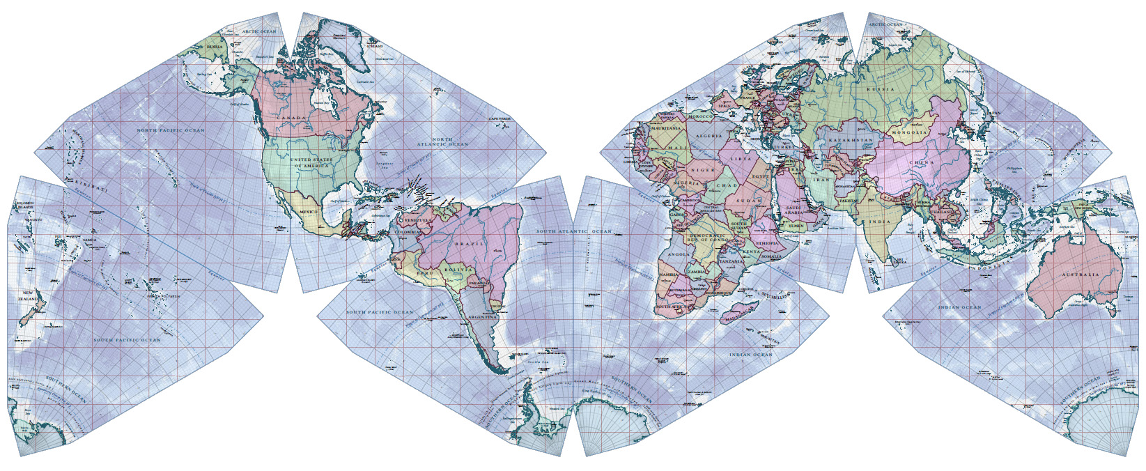
Figure 3. Political world map for 2013 CE using the Cahill-Keyes Projection. Copyright: Duncan Webb CC BY 1.0
[1] http://geoawesomeness.com/top-7-maps-ultimately-explain-map-projections/
[2] http://www.authagraph.com/products/map/product-article-01/?lang=en
— Dania Rose-Sperling